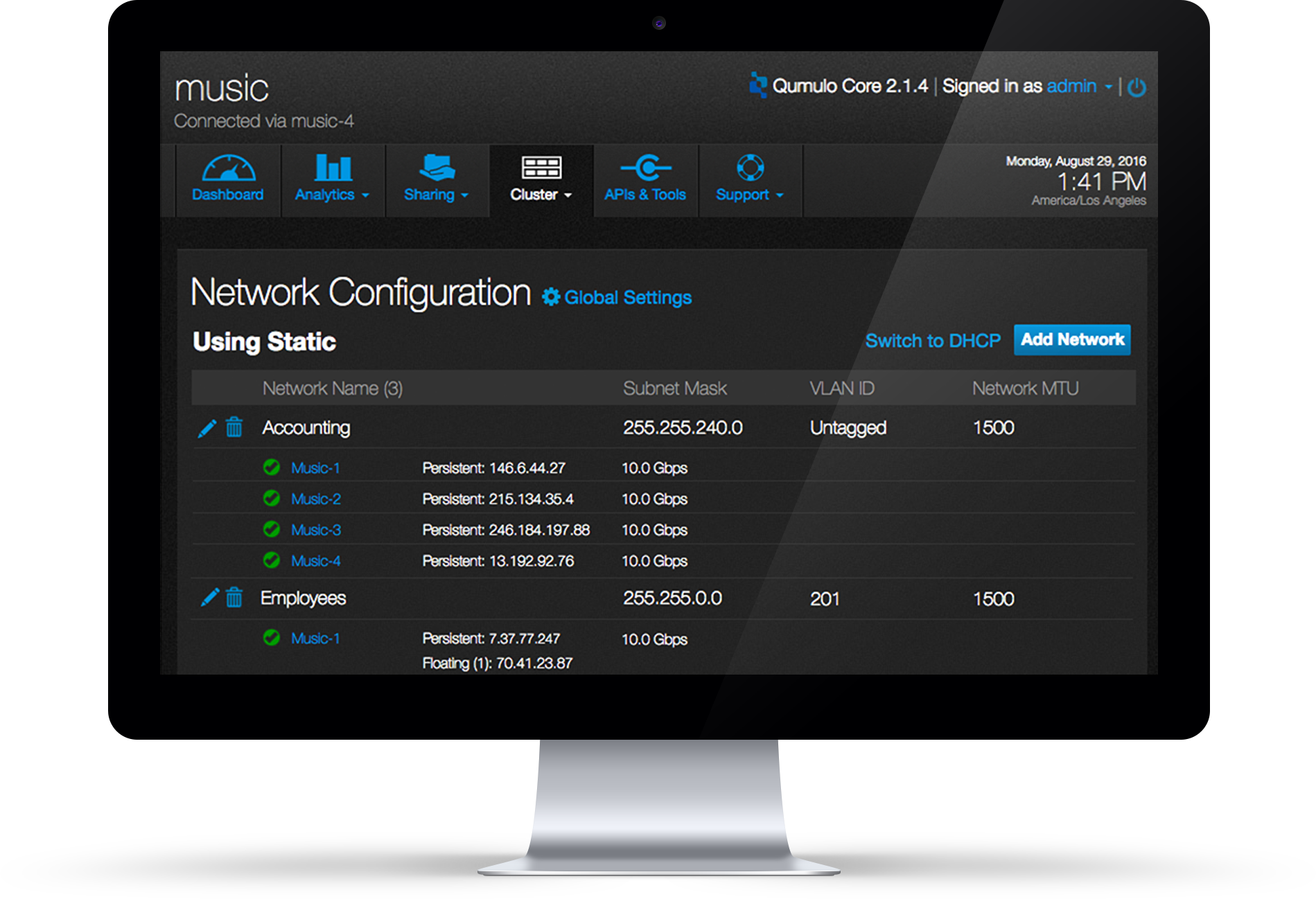
Redesign Network Config
Project Introduction
This two-month project is what I recently worked on at Qumulo. As the UX designer of this project, I was overseeing UX from the conception stage to launch. Collaborating with the dev team and PM, I defined the project scope, wrote user stories and came up with the design solution and usability test plan. By launching the new network configuration page with more functionalities, we enable users to have a better experience when managing their network environment.
Company
Qumulo
Created
07/2016
Role
UX Designer
Before redesign
The current UI enables the users (personified as storage generalist Gerald) to connect the system - Qumulo Core, to either one static network or one DHCP network. As we have more users, the user needs diversified. Another type of user (personified as storage admin Stanley) wants to connect the system to multiple networks. This new user need drove the redesign work.
What's the goal of this project?
Through the newly designed UI, the users (both Stanley and Gerald) will be able to connect the system to multiple networks, view the status of each network, management multiple networks and switch between DHCP and Static protocol.
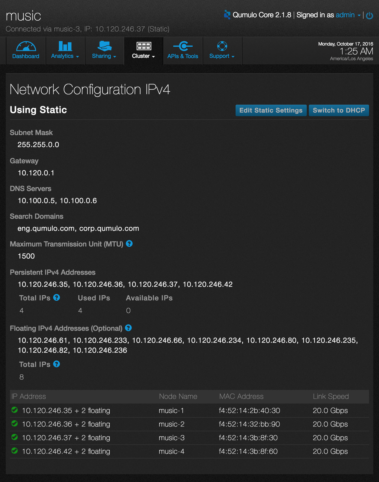
Old Config Page
Design Process
1. User Research
The PM had talked with a lot of users before this project started and generated a rough idea of what the new function Stanley needs. Based on that, I started interviewing our customer support team to prioritize the users needs.
2. BrainStorming
Notes from brainstorming session
UX flow draft
3. Create UX flow
Collaborating with PM and engineers, I defined the scope of FSV(first sellable version) as well as its relevant user stories in prioritized order.
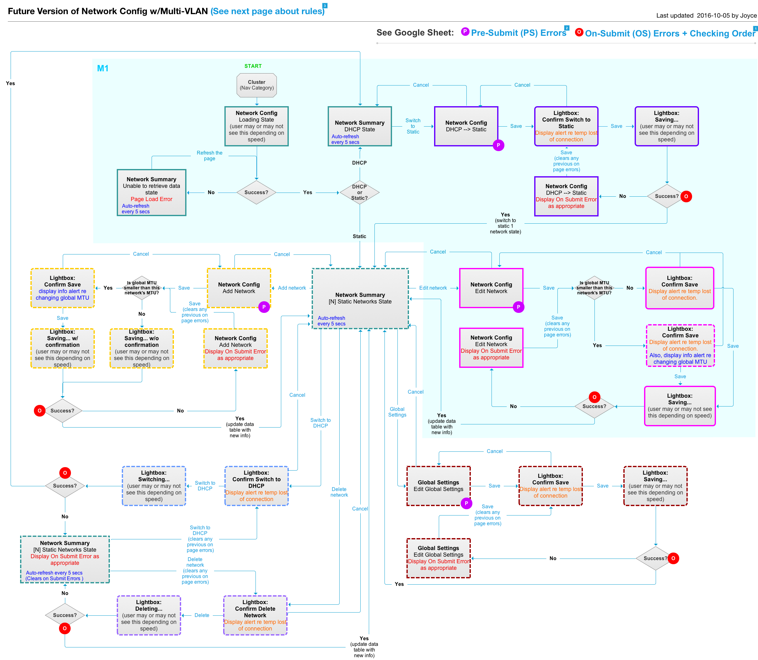
UX flow diagram
4. Sketch and wireframe
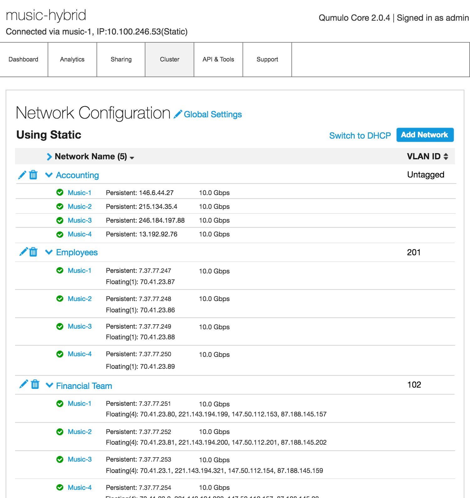
Wireframe - Network Summary Page
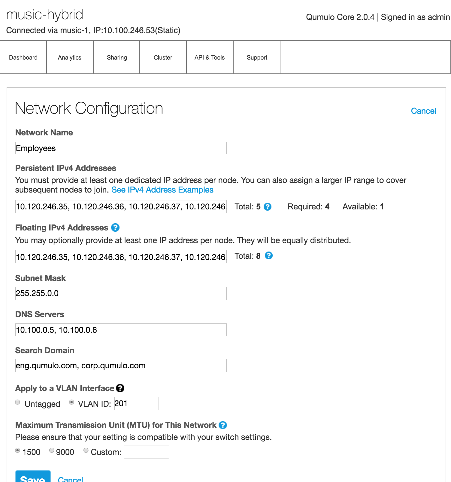
Wireframe - Edit a Network Page
5. Usability Test
We conducted usability tests with 10 people from our customer base. After the usability tests, we found out the new set of design is well understood by both types of users Stanley and Gerald. There were no major stumbling point for users when they were trying to accomplish the tasks.
Here’s a quote from one of our users:
“Seems really straightforward - it’s probably the most complicated set up to config of cluster - it’s really simple, especially compared to other system that I’m used to.”
6. High-fidelity Design and Specification
After the usability tests, I feel pretty confident about the design. After making several tweaks based on usability test feedback, I moved to visual design and specification part.
What I learned from this project?
1. Persona
As we are having more and more users, the new design needs to satisfies both Gerald, the generalist and Stanley the specialist. The old design satisfied the need of our user Gerald who is a generalist. In order to meet the needs of Stanley, the complexity of the new design increased compared with the old one. For example, Stanley wants to be able to change the bond settings of the cluster while Gerald only wants to use the default bond settings. The challenge here is how to make sure Gerald can still accomplish his work easily without being confused by the new expertise.
2. Iterative Development
Another thing I learned from this project is about how to build the product incrementally and iteratively, aka design iteratively. When I started designing, I tend to think the design in a complete picture. But that doesn’t always ends up being implemented fully because we don’t have resources and time to build the full set of design at once. The challenge is not thinking what is possible but what is necessary, how do we deliver the feature incrementally at the same time delivering values to our users.
Final Product Screenshots
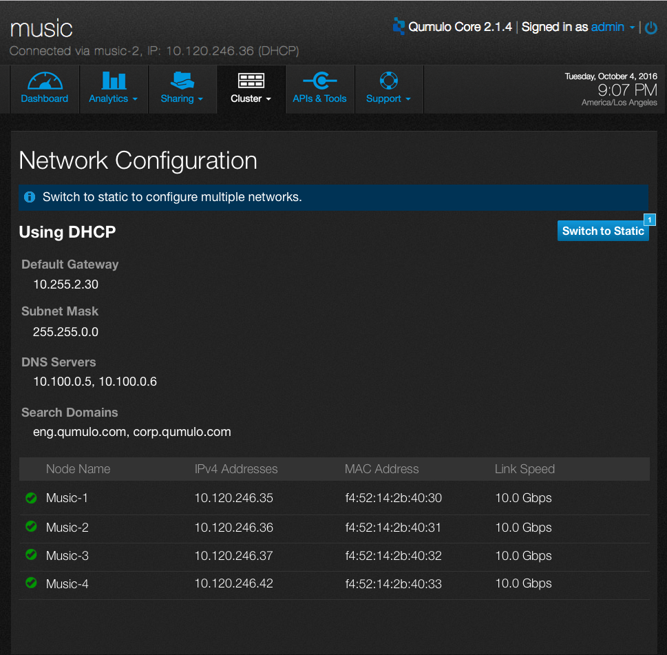
Summary - 1 DHCP network
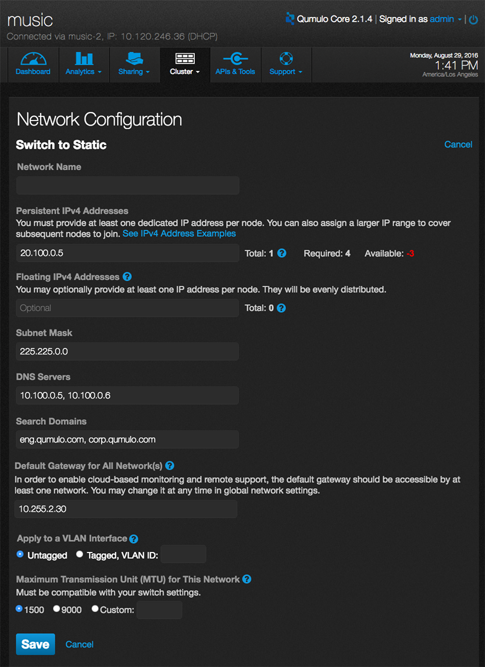
Switch to Static
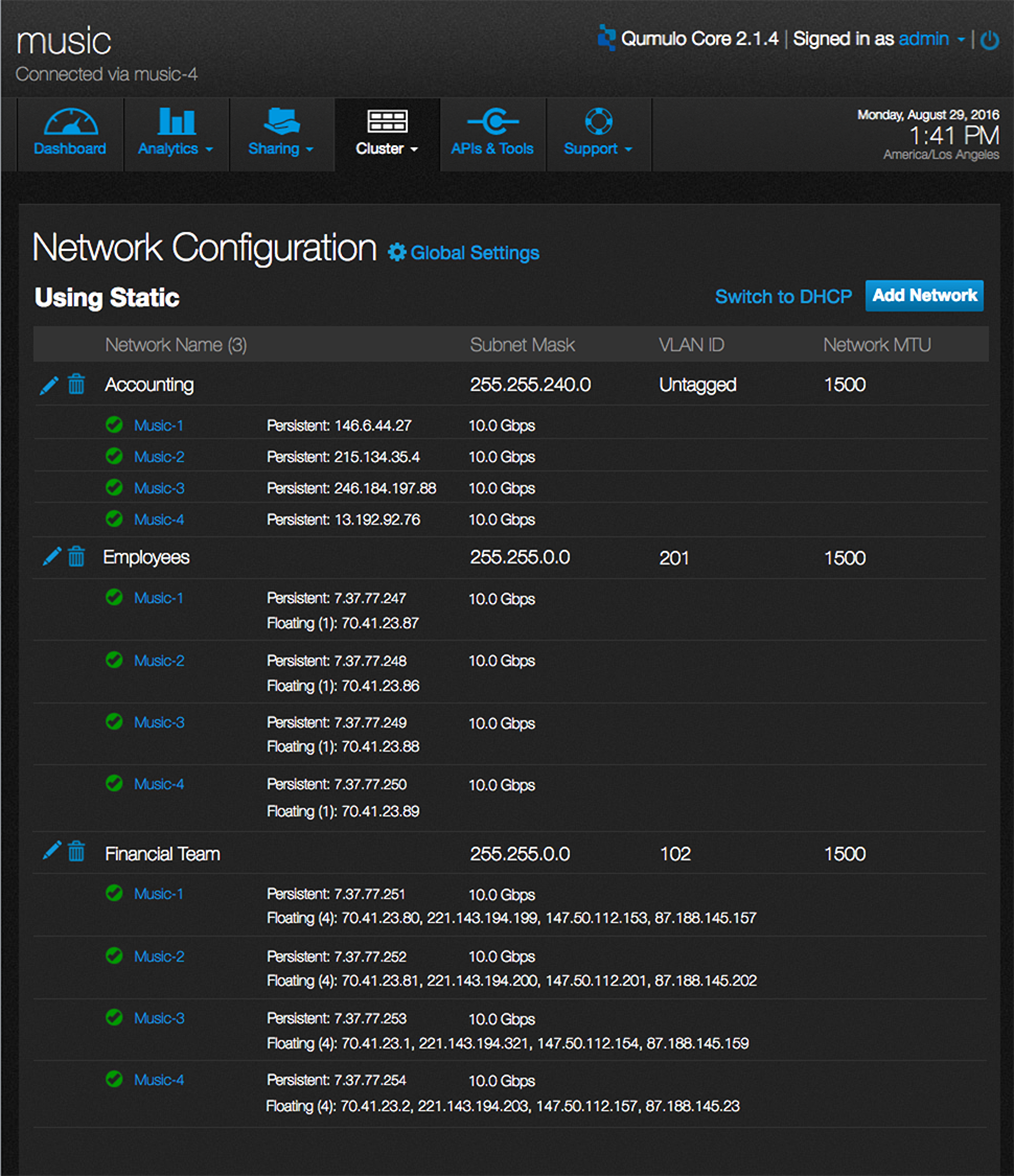
Summary - N static Networks
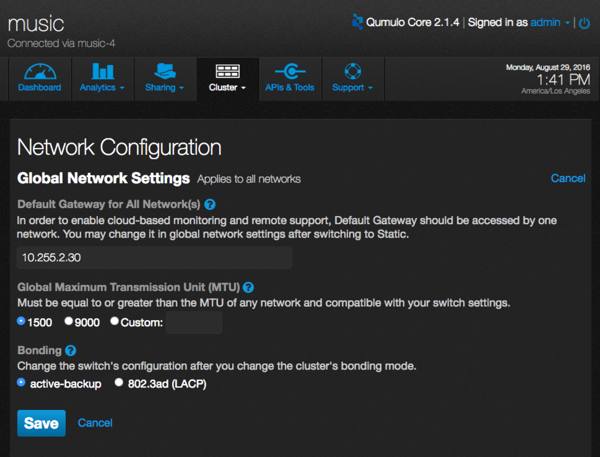
Global Settings
More projects
Seattle, U.S.
(206) 953 5592
joyce90829@gmail.com