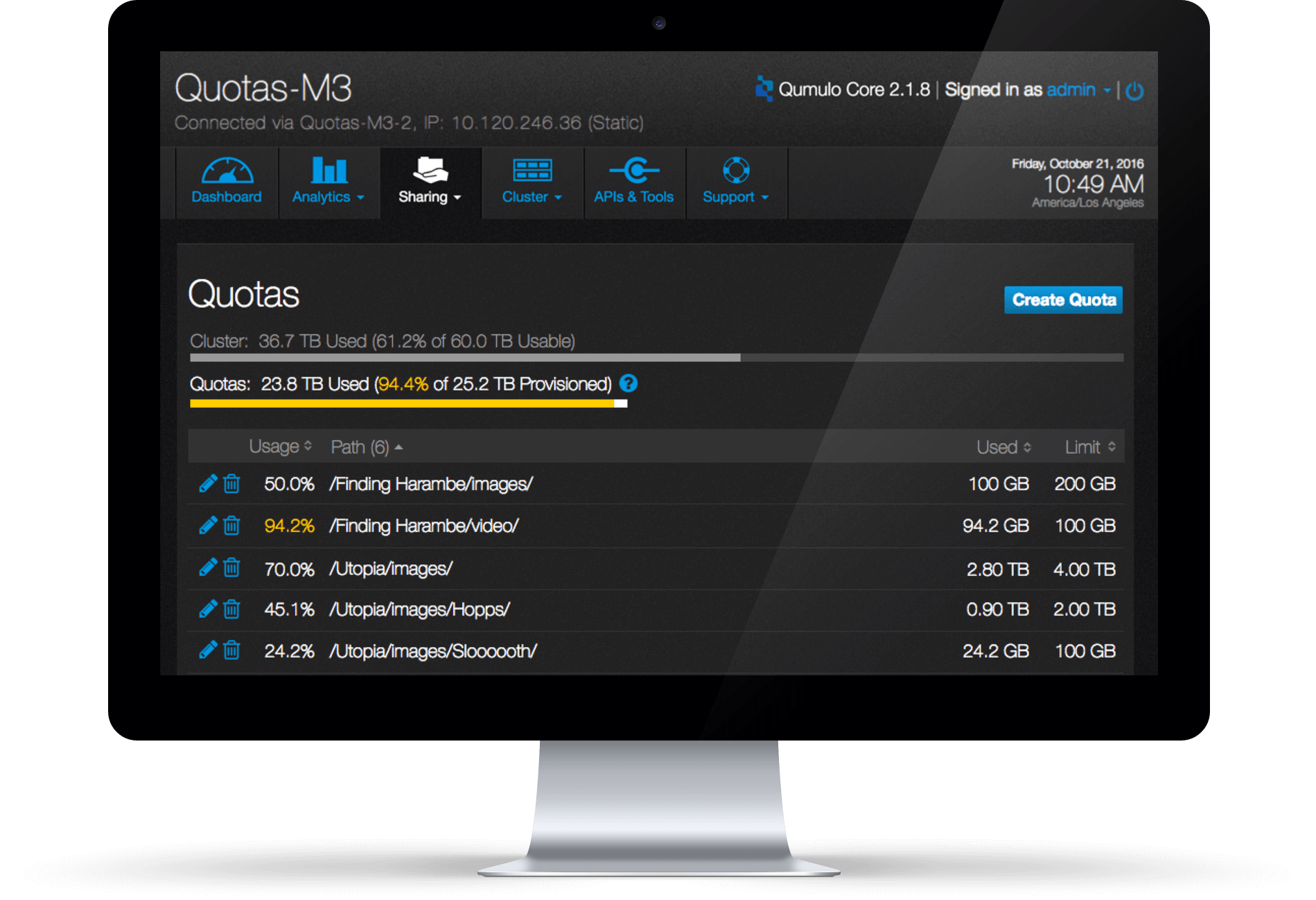
Quotas
Project Introduction
Quotas is a cross team project I was working on at Qumulo. We want to find a way to help the storage admin (personalized as Gerald) to oversee his storage usage and prevent end users from over using it.
Role
UX Designer
Duration
2 Months (Oct&Nov/2016)
Skills
Interaction design, Usability testing, Info Visualization
Problem
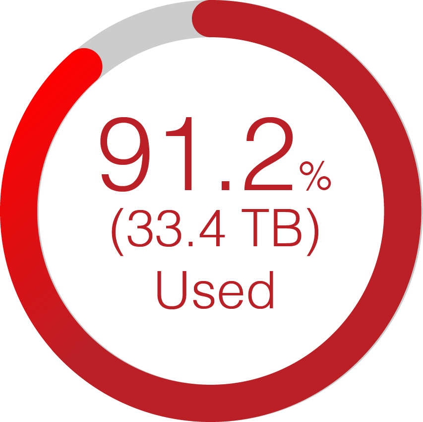
One of storage admin's nightmares is that when he wakes up the next day morning, some end user just used most of the available space in the system. Thus no one else can use the system and it brings performance impact.
Goal of Design
Storage admin can set a limit on the directories of the cluster so its end users won't over use the storage. At the same time, Gerald can see how close the directory usage is hitting the limit so he can warn end users to clean up their directories soon.
Design Process
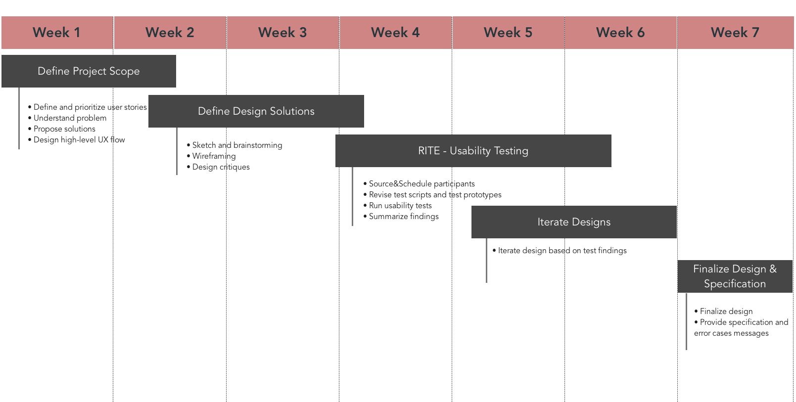
Project Timeline
As the designer of this project, I worked closely with PM, front-end and back-end engineering teams in the whole design process. I collaborated with PM to define the project scope and user stories. I discussed with engineers about potential solutions.After coming up with the design, I conducted two rounds of usability tests with users and refined the design based on usability tests findings.
1. User Research
The PM had interviewed with a lot of users before this project started and defined the scope of the project. I started this project with understanding the problem we were trying to solve and conducting competitor analysis to find out what the differentiators could be for our product.
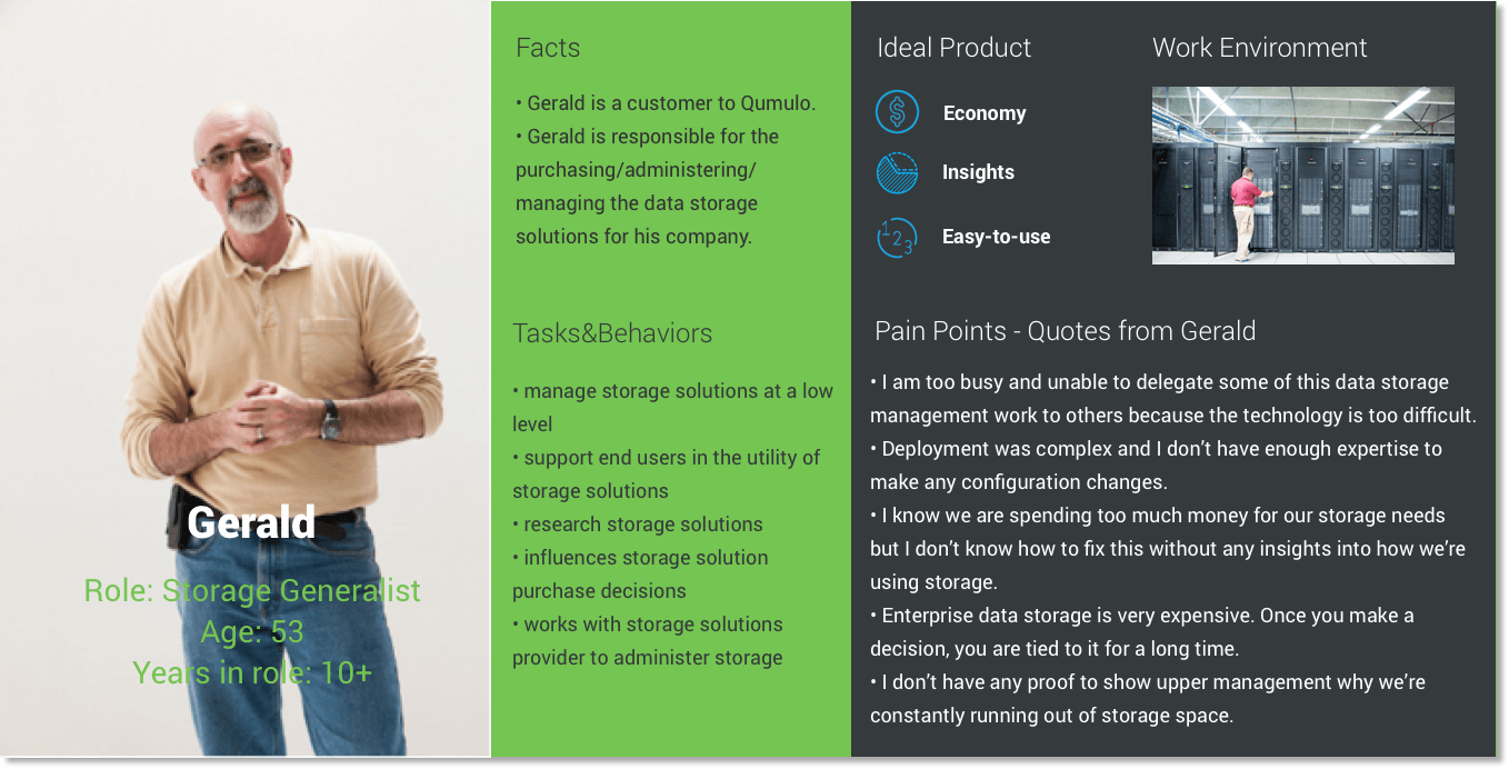
Persona - Gerald
2. Define problem and potential solutions
A lot of end users tend to over use capacity of the system. And it is very hard for Gerlad to find out if he doesn't set a boundrary on it.
Gerald does assign a definite space to end users. But sometimes Gerlad tends to assign more space than the total usable space of the system. He doesn't know when his storage will be filled up and how close it will be filled up. There is no visibility on that.
Problem
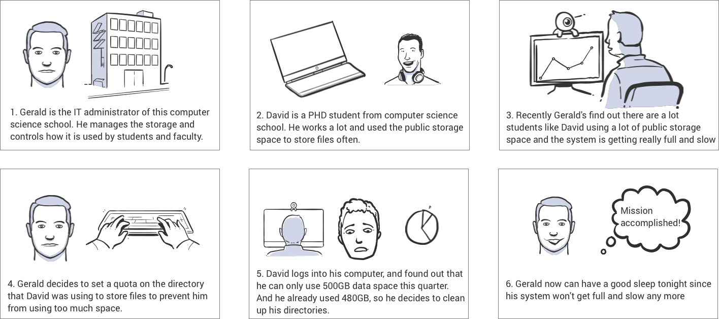
Storyboard
Gerald can create/manage a Quota through UI so that he can prevent end users from using too much space in the cluster.
Solutions to meet basic needs
"Insights": Gerald can see in real-time which directories are hitting the quota limit soon or already exceed the quota limit so he can take actions accordingly.
"Improved productivity": Gerald can easily manage the directory and the quota set on it (when the directory is renamed or deleted, the quota will reflect the change immedidately).
"Insights": Gerald can always see total provisioned quotas compared to cluster usable capacity so he can plan accordingly.
Solutions to differentiate us from competitors
3. Create UX flow
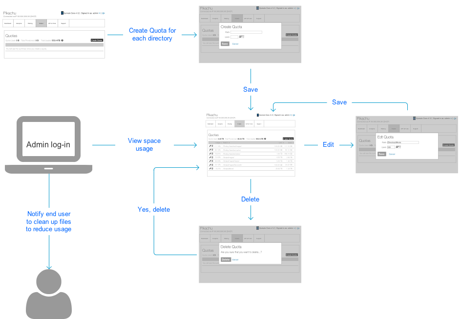
UX flow diagram
4. Wireframes design
The design reused the pattern we currently have of our product: creating an item in the table, and edit/delete the item from the table. The benefits of reusing a pattern:
There are no extra learning efforts needed for users who are familiar with our product. It is a consistent experience across the product.
Engineering team can reuse the pattern (react components) they have already built to build this page.
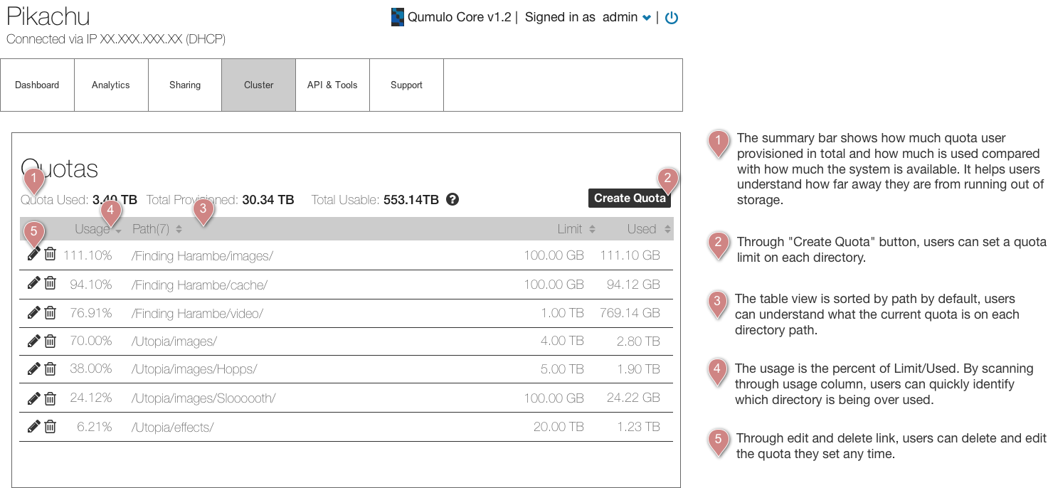
Wireframe - Quota Summary
Since I am applying pattern into the design, I feel pretty confident of moving forward to the high-fi prototyping stage. And I chose to use high-fi prototypes to test with users instead of low-fi wireframes.
5. Usability Testing
The goal of usability testing is to evaluate the usability of design as well as validate differentiators. We conducted usability tests with 10 people from our customer base. Through the usability tests, we validated the hypothesis and found out the two usability issues. There were no major stumbling point for users when they were trying to accomplish the tasks.

Here’s some quotes from one of our users:
“(After we explained how the system will behave) That’s a whole new category of file system analytics and understanding of what users are doing under the hood that we don't currently have, that would be phenomenal.”
“I want to see insights. I usually use CML to set up quotas. If I come to UI, I want it to show me the trend.”
Usability Issues
There are two major usability issues we found through usability test.
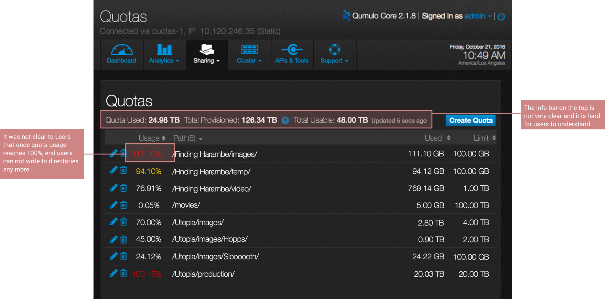
Major usability issues
6. Iterate design
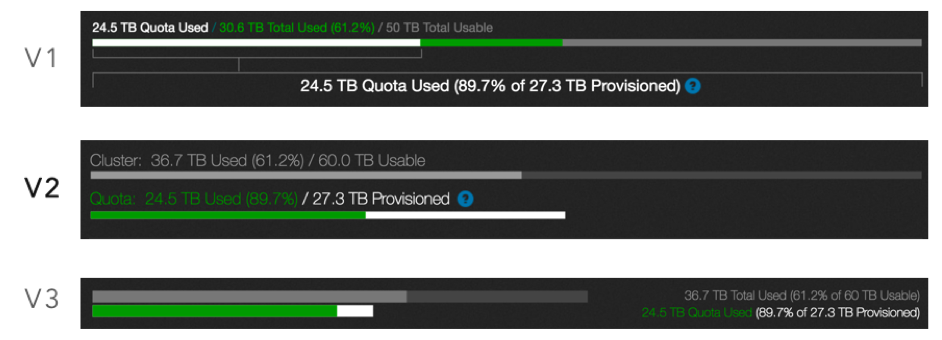
Info bar variations

Quota enforced state variations
We tested Variation 1-3 with users. We found out that users prefer texts over icon because they have different understanding of icons. Also they would prefer to see usage and red texts next to each other so they wouldn't need to hunt for the information on their desktop.
Final Design

Final Design - Quota Summary- Under usage
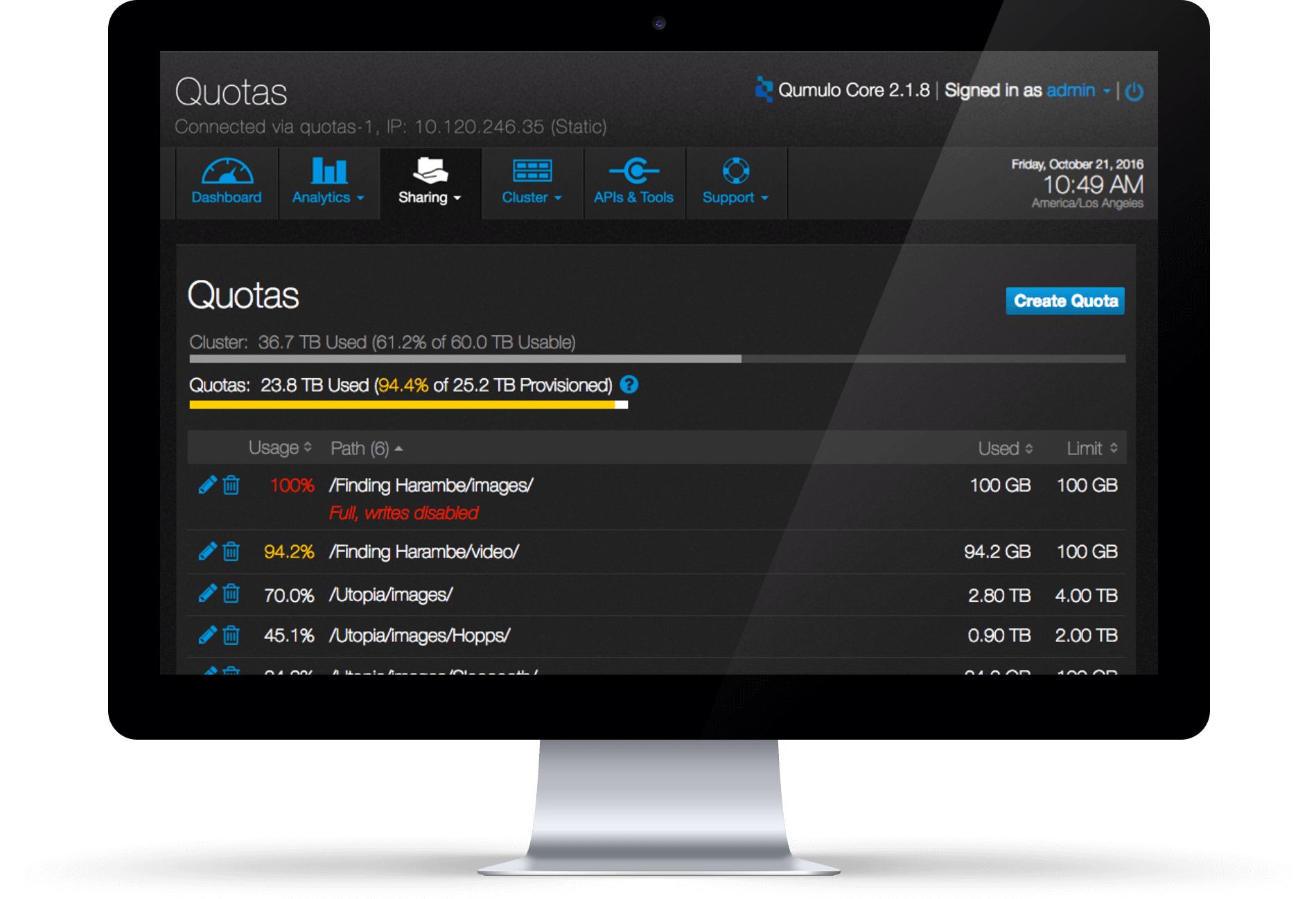
Final Design - Quota Summary- Over usage
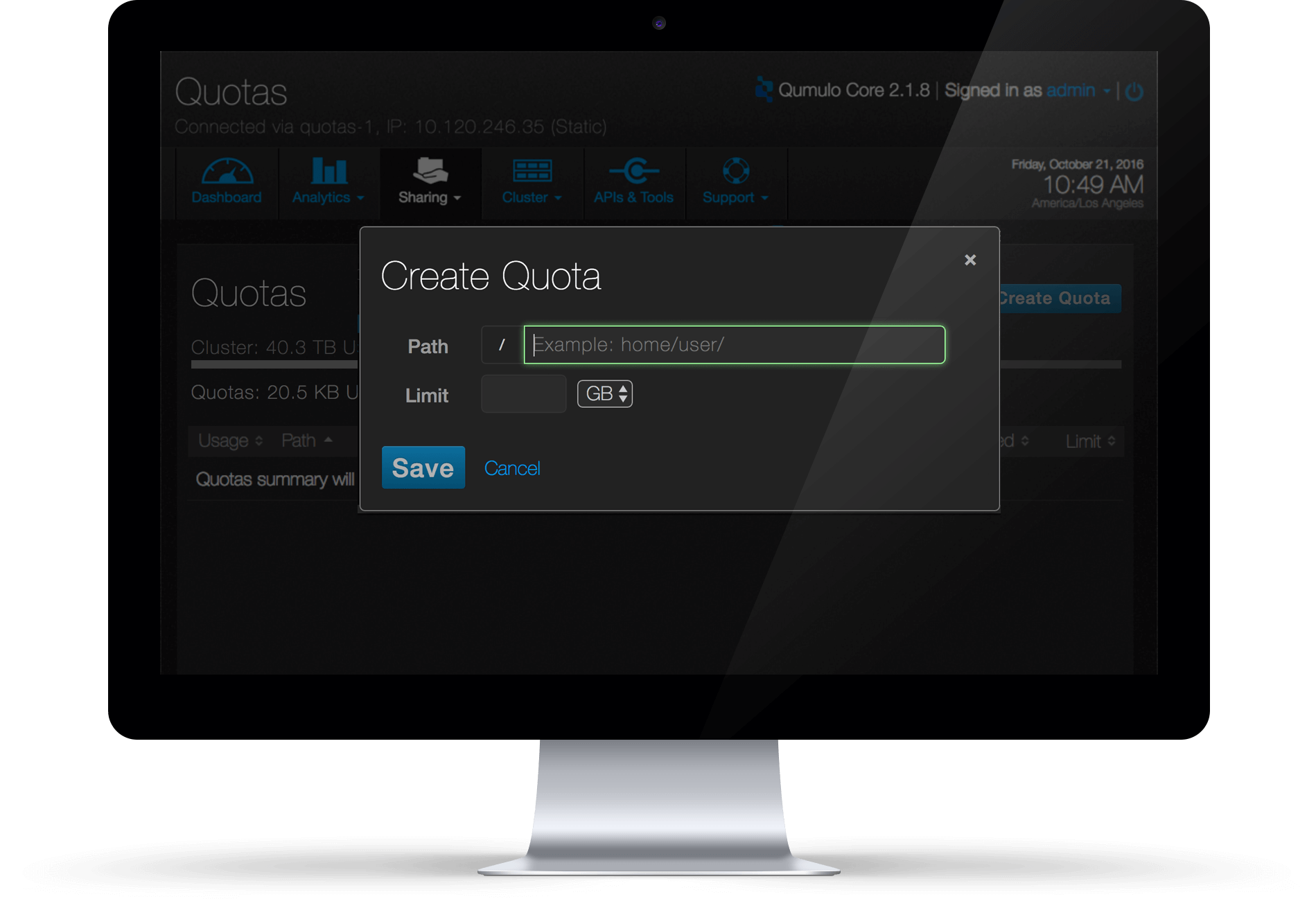
Final Design - Create Quota
More projects
Seattle, U.S.
(206) 953 5592
joyce90829@gmail.com